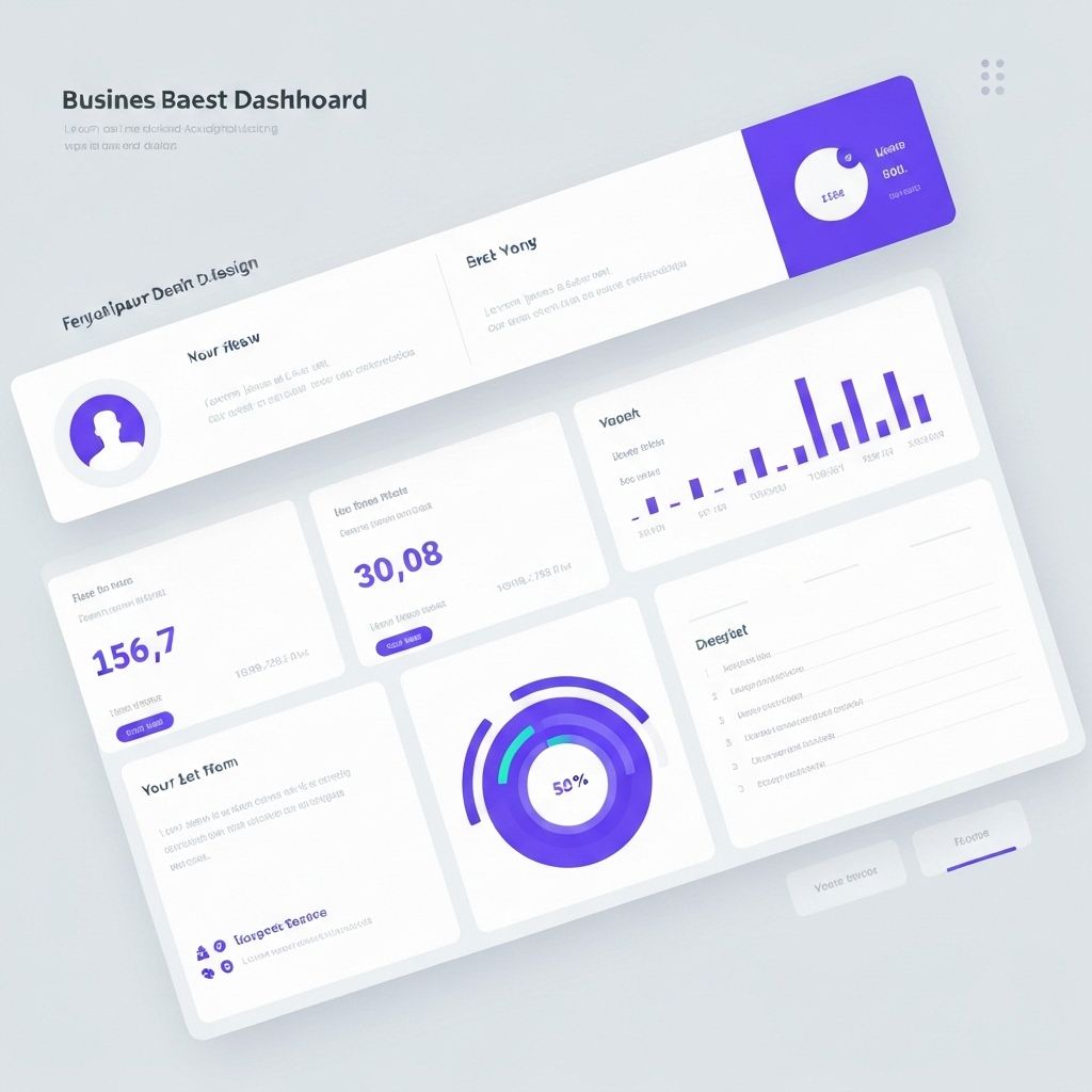
Designing Dashboards That Drive Decisions
A well-designed dashboard is more than a collection of charts—it's a decision-making tool that guides users to insights and actions. Here's how to create dashboards that work.
Hierarchy and Layout
Organize information by importance. Place the most critical metrics at the top or in prominent positions. Use size, color, and position to create visual hierarchy that guides the eye naturally.
Context is King
Numbers without context are meaningless. Always provide comparison points: previous periods, targets, benchmarks, or industry averages. Help users understand not just what the numbers are, but what they mean.
Interactivity with Purpose
Interactive elements should enable exploration, not create confusion. Filters, drill-downs, and tooltips should feel intuitive and add value to the user experience.
Performance Matters
A slow dashboard is a useless dashboard. Optimize queries, use appropriate aggregations, and consider caching strategies to ensure snappy performance even with large datasets.