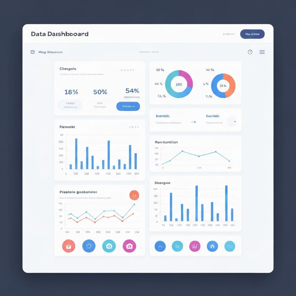
Creating Visualizations That Work
Great data visualizations combine aesthetic appeal with functional clarity. Here are ten essential best practices that separate amateur charts from professional insights.
1. Start with Your Audience
Before creating any visualization, understand who will view it and what decisions they need to make. Executive dashboards require different approaches than technical analysis reports.
2. Choose Appropriate Colors
Color should enhance understanding, not distract. Use color purposefully to highlight important data, show categories, or indicate status. Ensure your palette is accessible to colorblind users.
3. Minimize Chart Junk
Remove unnecessary elements that don't add value. Every line, label, and decoration should serve a purpose. When in doubt, leave it out.
4. Label Clearly and Completely
Your chart should be self-explanatory. Include clear titles, axis labels, units of measurement, and legends when needed. Viewers shouldn't have to guess what they're looking at.
5. Maintain Consistent Scales
Manipulating scales can distort perception. Start axes at zero when showing magnitude, and be transparent about any scale adjustments.
